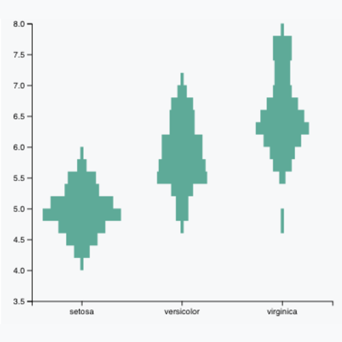
d3.histogram()
The d3.histogram() takes a numeric variable, split it
into bins and count the number of value per bin. See the
histogram section for basic examples. It
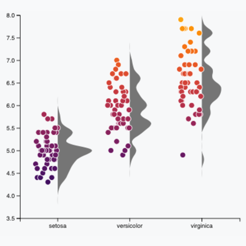
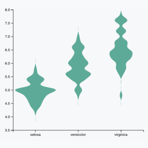
is possible to represent the histogram with a mirror effect for
each group and using a curving function for smoothing: it makes
the violin plots below.

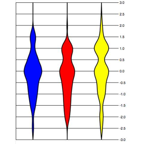
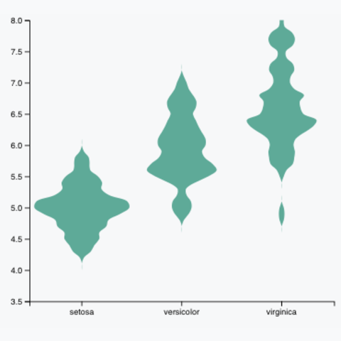
Another way to build a violin plot is to compute a kernel density estimate. This is what is done in the density plot and ridgeline plot sections. As you can see, the result is slightly different compared to above.
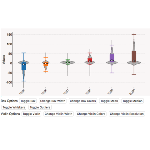
A few examples expanding the concepts described above to build custom violin charts.